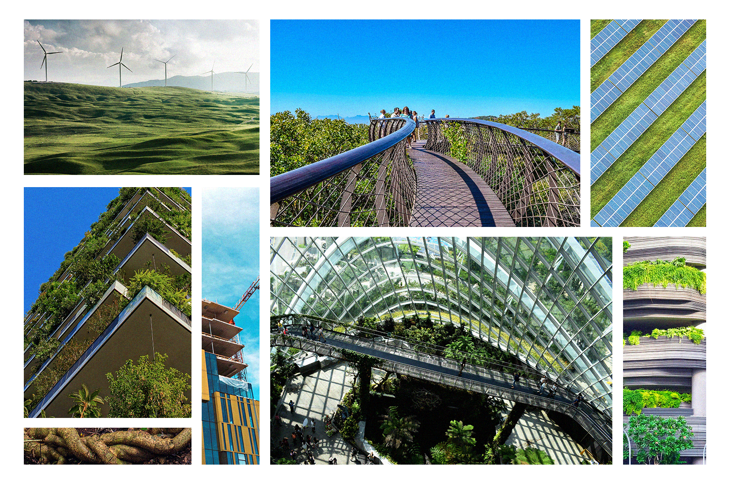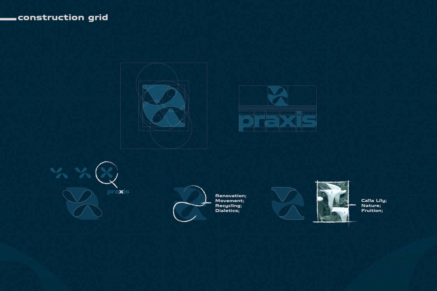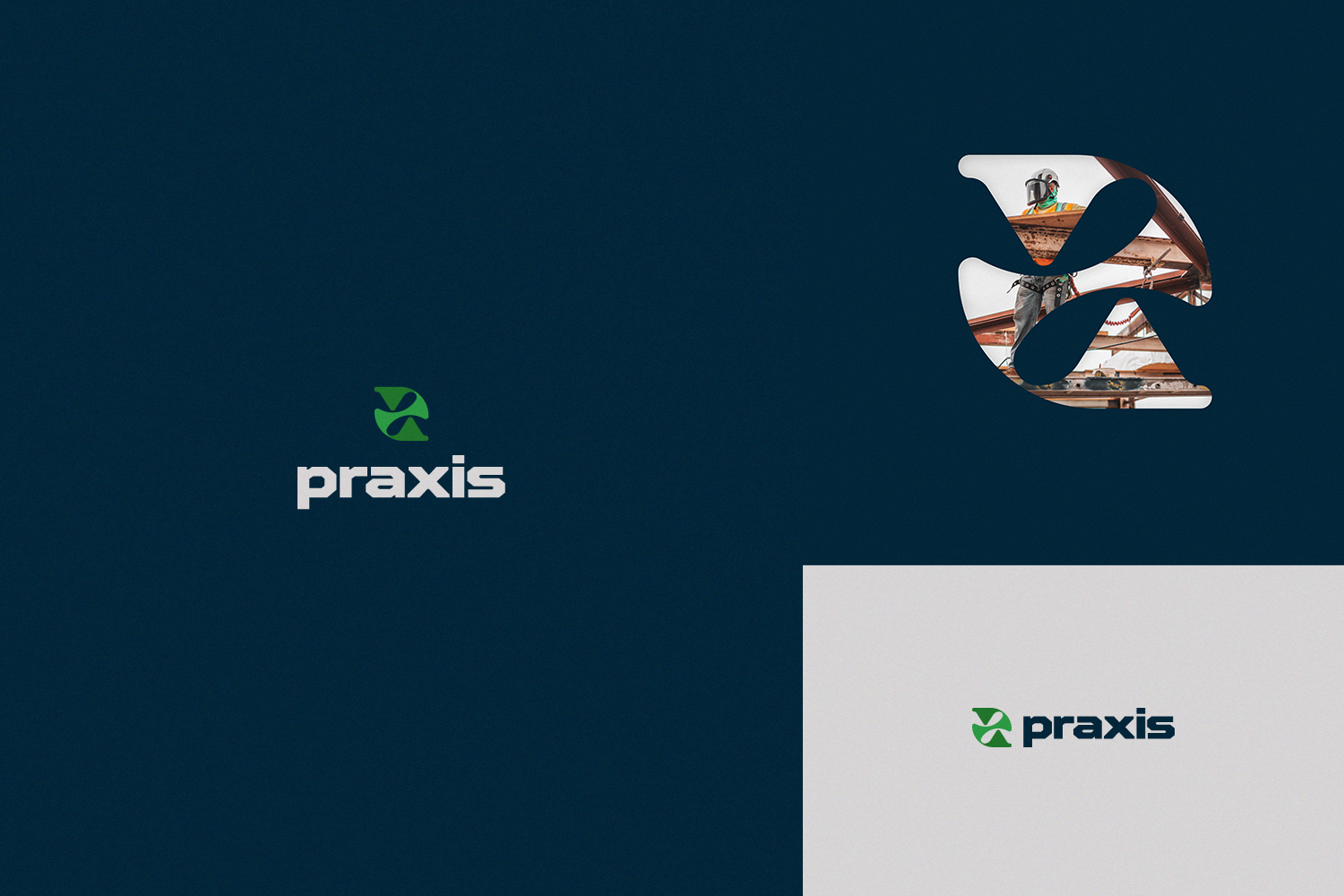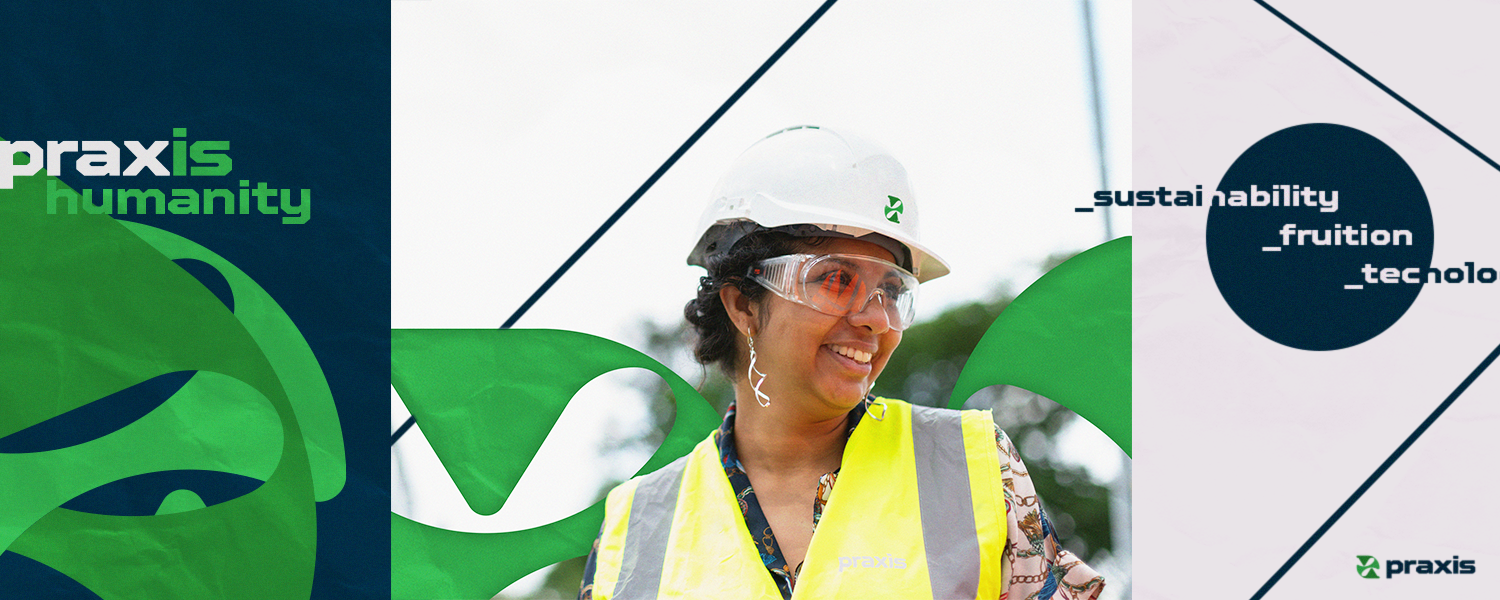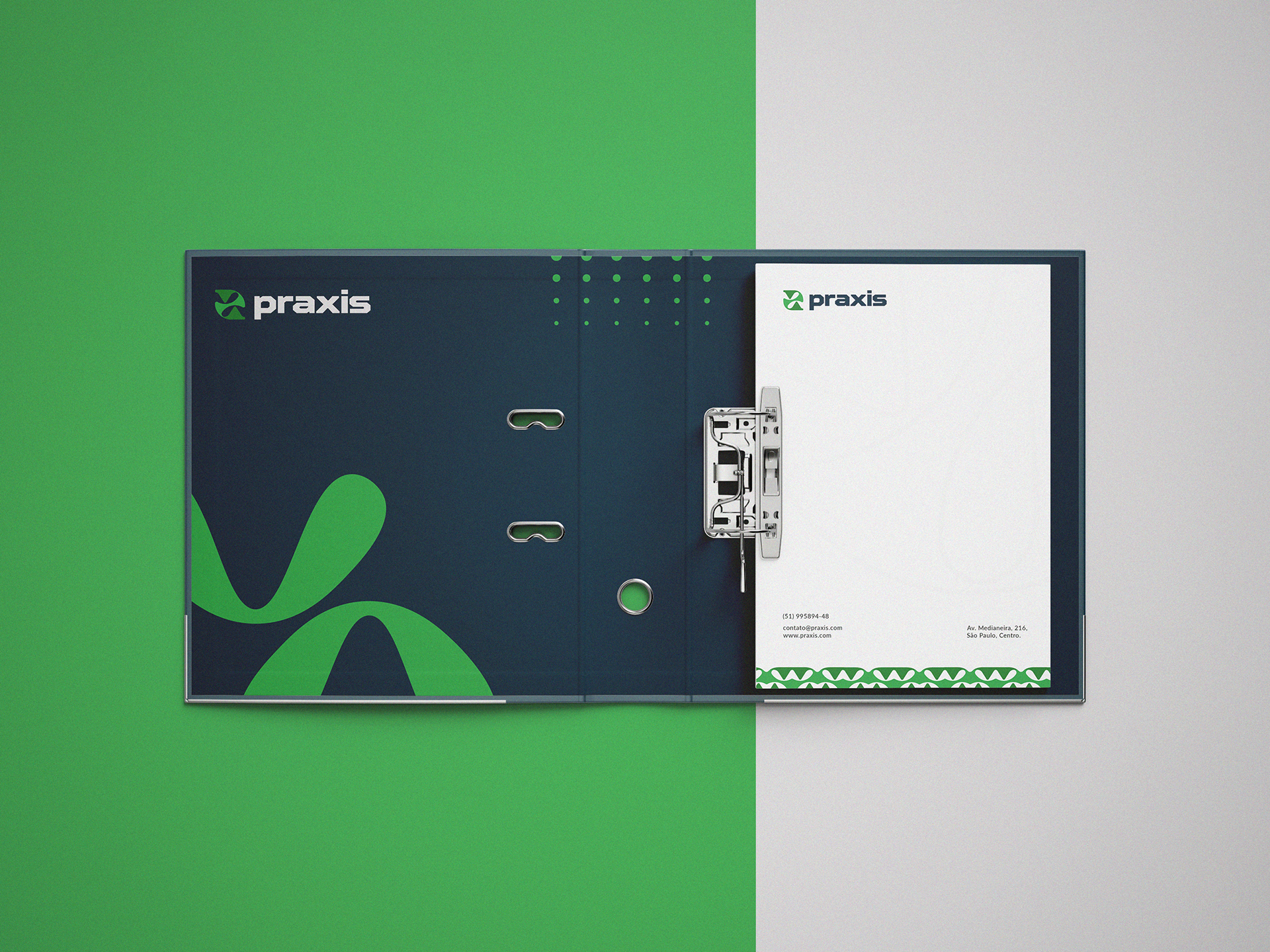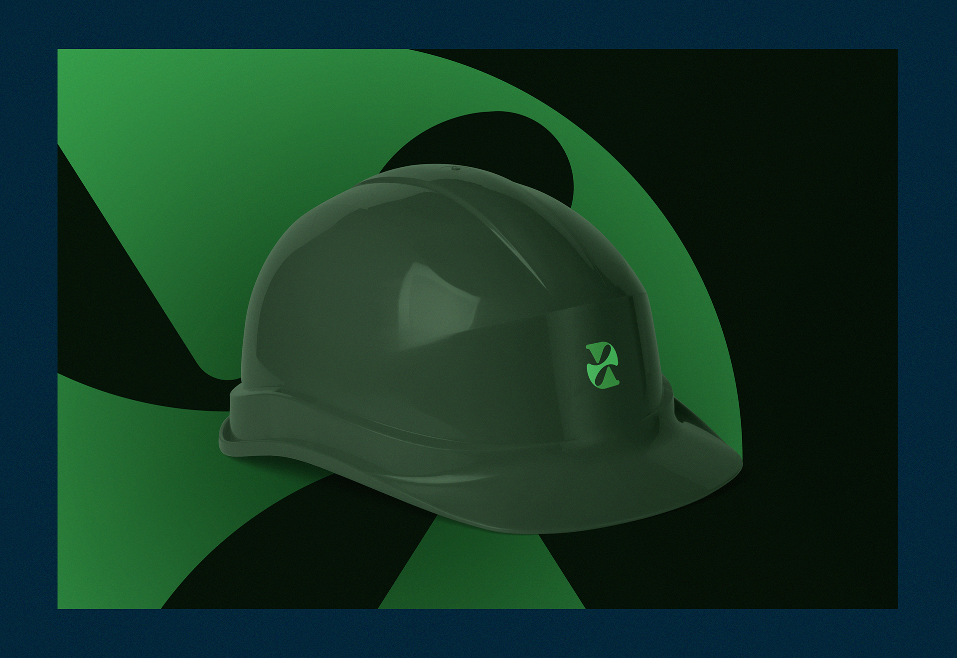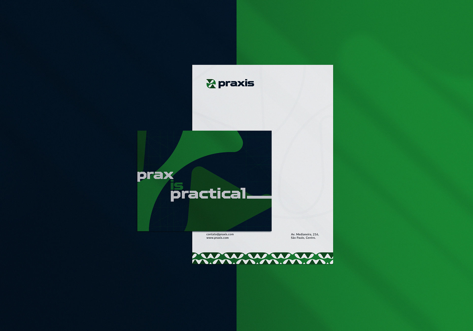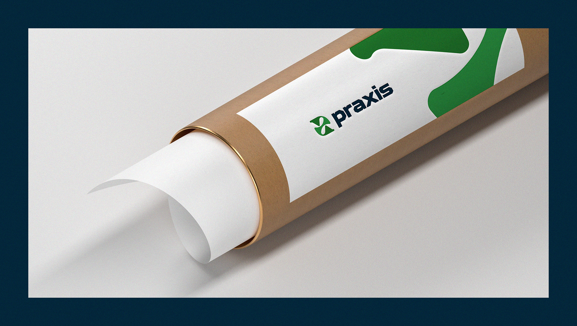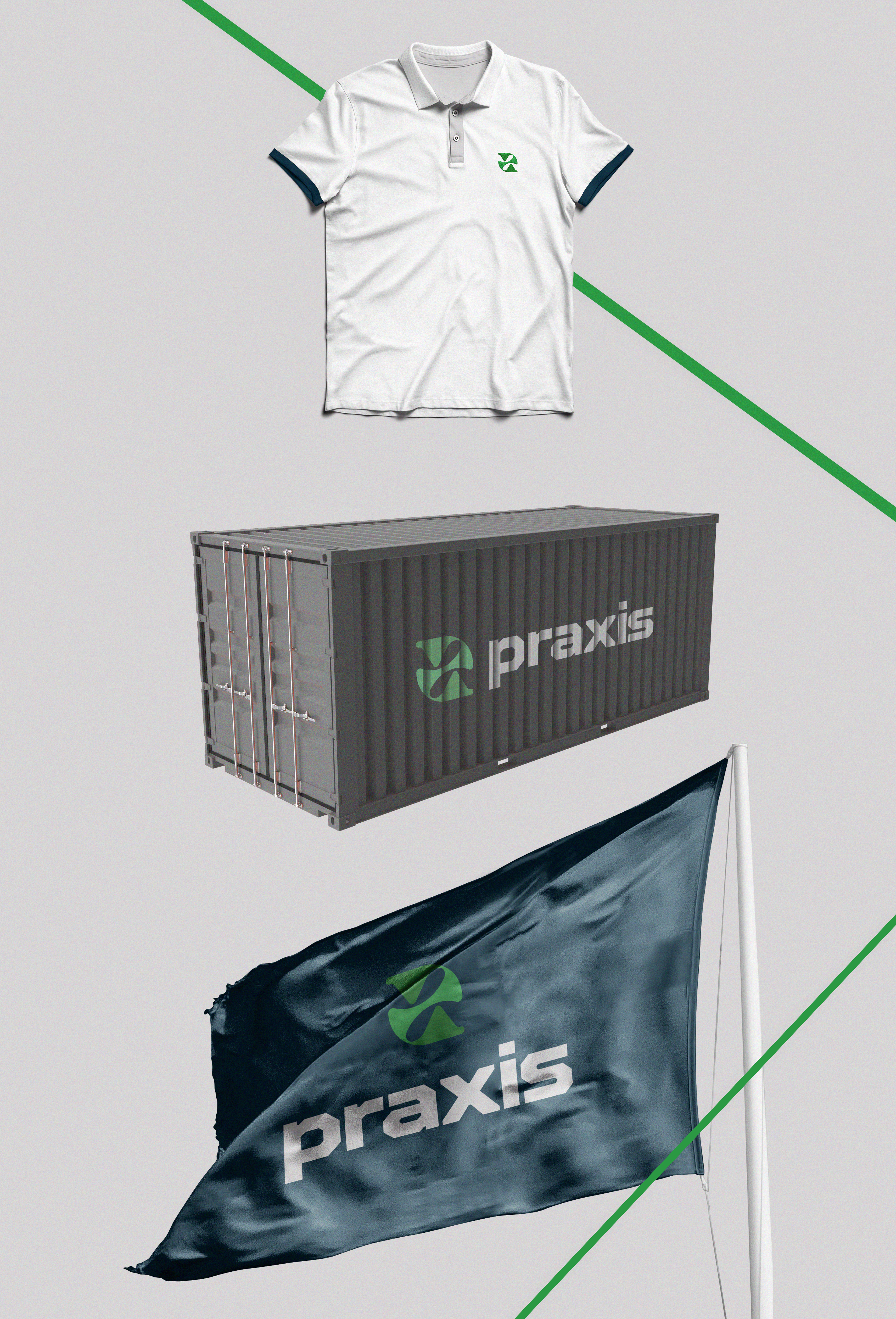
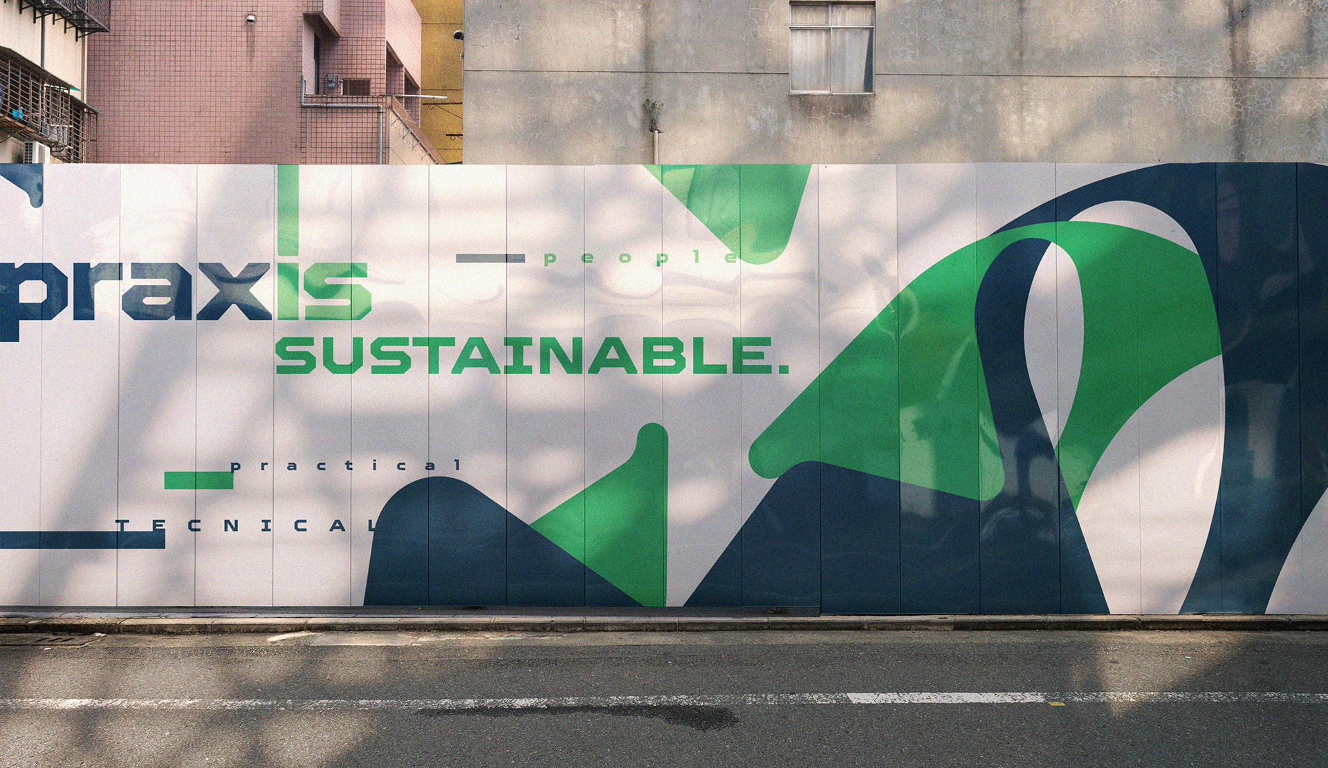
EN | It is a civil construction company that focuses on the integration between nature and architecture, aiming at projects that involve sustainability and technology. Thus, an extremely fluid brand was developed, which absorbs the trends of nature in its own form and content. An elegant and beneficial color palette was applied, from the dark blue of the night sky to the tons of green that refers to fields and forests, reinforcing the idea of sustainability. The symbol, in addition to referring to flowers, carries fluidity and movement, conveying an idea of recycling, renewal and innovation. From the intertwining of the symbol, supporting graphic elements were developed that refer to the vines of the jungle and the enjoyment of time. Finally, a robust and geometric typography was used, conveying security and credibility.
-
PT-BR | É uma empresa de construção civil que tem como foco a integração entre natureza e arquitetura, visando projetos que envolvem sustentabilidade e tecnologia. Assim, foi desenvolvida uma marca extremamente fluída, que absorve as tendências da natureza em sua própria forma e conteúdo. Foi aplicada uma paleta de cores elegante e benéfica, desde o azul escuro do céu noturno aos tons de verde que remetem aos campos e florestas, reforçando a ideia da sustentabilidade. O símbolo, além de remeter às flores, carrega a fluidez e o movimento, transmitindo uma ideia de reciclagem, renovação e inovação. A partir do entrelaçamento do símbolo, foram desenvolvidos elementos gráficos de apoio que remetem aos cipós da selva e o fruir do tempo. Finalizando, foi utilizada uma tipografia robusta e geométrica, transmitindo segurança e credibilidade.